
07 May TREND STORY: ART HAUS

Product Shown (from top left clockwise): Masai Vase by Serena Confaloneiri, CC Tapis Rugs photo by Lorenzo Gironi, Goody Bag Collection by Gabriela Noelle, Watertower by Tom Fruin, Beverly Fishman Art detail
Inspired by art movements like the Bauhaus as well as the Modern Memphis style and the Pop Art genre, Art Haus consists of large geometric shapes in bright vivid colors. A primary color palette dominates this trend, along with a few saturated pastels to accentuate the bright colors. Art Haus explores the way we experience art, from the framed pieces on the wall to the objects we use in every day life. This playful movement transforms ordinary objects into masterpieces, finding beauty, yet simplicity, in everything we surround ourselves with.
Pattern:
Geometric color blocking, Bauhaus asymmetric patterns, organic linework layered on block print, modern art
Color:
bright primary, saturated pastels

Experiment with the color combinations below to capture the Art Haus look!

A primary color palette is eminent of the Bauhaus movement as these colors evoke a classic, playful and modern style.

Pastels ease the eye into the more saturated tones while hints of bright colors keep the palette from feeling dull.

Primary colors, pastels, brights and a hint of stark black balance one another out to create a fun and interesting color palette.
Love this palette as much as we do? The Life-Styled by Stacy Garcia team has put together a shopping guide influenced by the cleansing energy of Aura!
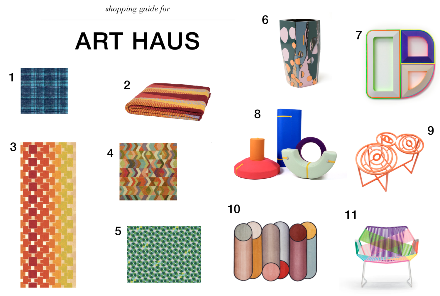
1. Stacy Garcia Commercial for Durkan: Mod Market Collection – GA16802 2. Stacy Garcia | New York for In2green: Modesto Eco-Throw 3. Stacy Garcia Commercial for Brintons: Camp Revamp Collection – 9/S3489SG 4. Stacy Garcia Textiles: Watusi – Geranium (available through TRI-KES, Eykon Design Resources & D.L. Couch) 5. Stacy Garcia Commercial for Brintons: Camp Revamp Collection – 7/S5371SG 6. Elyse Graham: Tasmania Vase 7. Beverly Fishman: Insomnia, Opioid Addiction 2017, Urethane paint on wood, 36 x 30 x 2 inches 8. Tijs Gilde: Array Flexible Furniture Collection 9. XYZ Architecture: Gyro 3 10. CC Tapis: Rotazioni 11. Nest Co: Moroso Tropicalia Armchair
No Comments