
19 Dec Color Crush: Blue Print

Products Shown: Top Left-Stacy Garcia for Durkan Pacific Rim Collection GA51856-MW438 Bottom Right-Stacy Garcia for Durkan Pacific Rim Collection GA51861-MW438
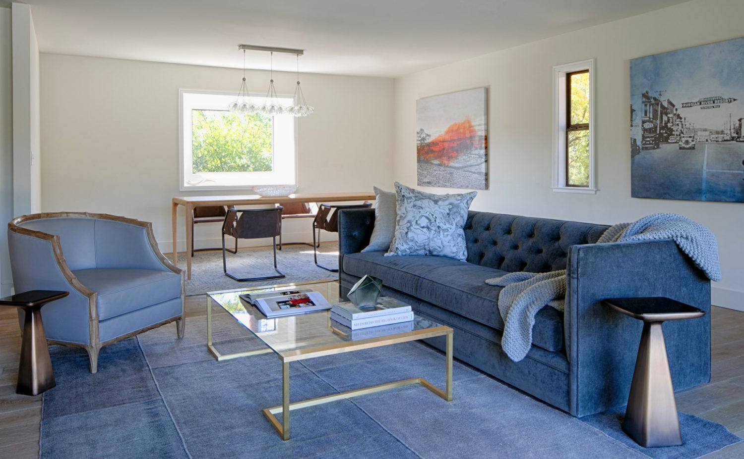
Through the chill of winter comes Blue Print, a calming, celestial hue. Surround yourself with Blue Print to create a relaxing retreat from the rush of the holiday season. Blue Print is on the rise through the revival of the time-honored Japanese craft, Shibori, a technique of dyeing and embellishing textiles. A softer tint of the customary indigo, the prominent pigment in this popular art method, soothing Blue Print exudes tradition.
Chameleon-like Color
As a chameleon-like hue, Blue Print can either be the center of attention or it can act as a neutral, depending what it’s paired with. If your goal is to create a restful and calming space, pair Blue Print with muted wood finishes with warm undertones. For a sophisticated and timeless look, pair Blue Print with crisp white and lustrous metal accents to allow this hue to shine, without overwhelming the space.
Love Blue Print as much as we do? Use PMS 646 C or Pratt & Lambert’s #27-23, Dusk Sky!


No Comments