
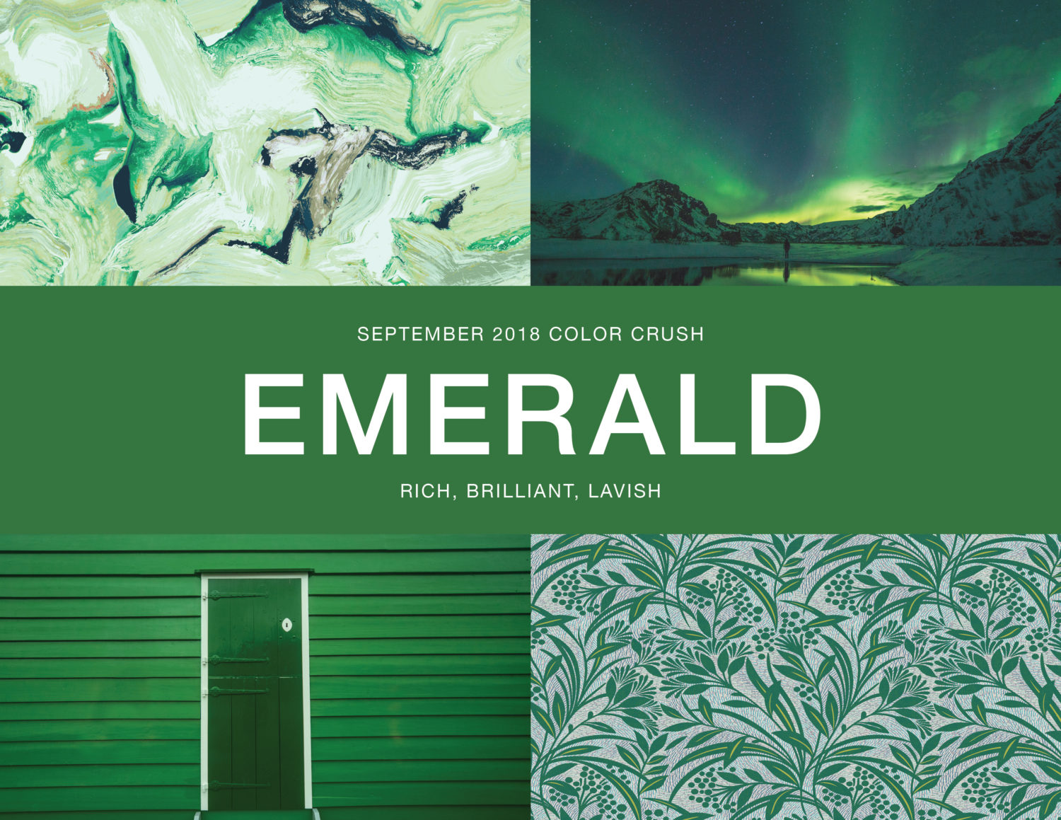
17 Sep Color Crush: Emerald
Upper left: Stacy Garcia Commercial Textiles Meditate – Emerald 1735-20-SAN, Lower right: Stacy Garcia Commercial for Brintons Camp Revamp, Americas 2/S5370SG
Taking name after the magnificent gemstone, Emerald is a deep green that speaks luxury. This vibrant hue conveys a feeling of empowerment through its well-defined and stately presence. Unsaturated tones are being kicked to the side and bold colors like Emerald are taking precedence in both fashion and interiors.
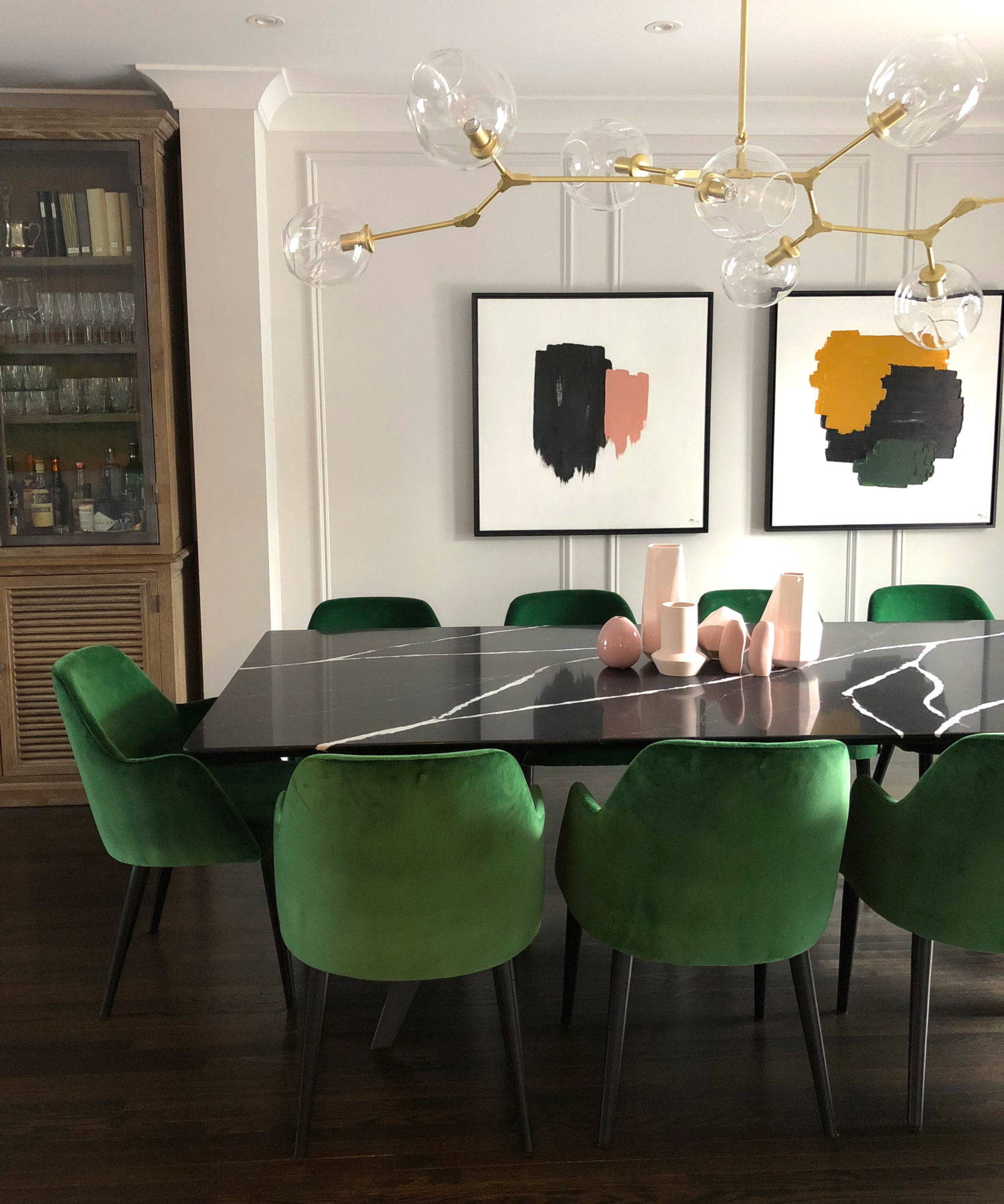
Velvet in Emerald
If you are not bold enough to drench your interior in Emerald, then try using it as an accent color on a richly textured fabric such as velvet. This will create a regal and luxurious look without overdoing it. Pair Emerald colored velvet in a space with brass details, clean lines, and unique lighting to create modern style.
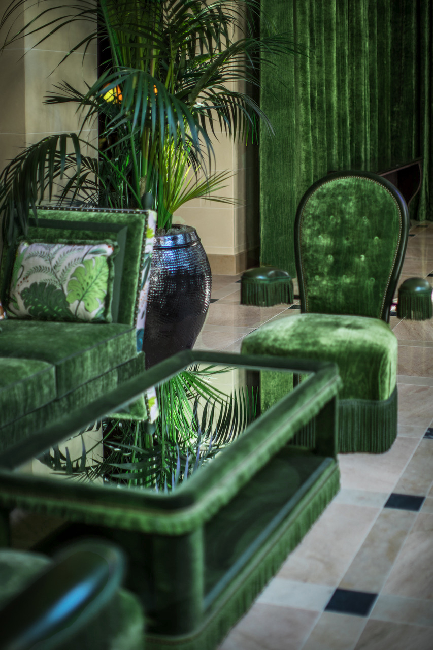
1920’s Glam
We see Emerald as a gorgeous jewel tone that can transform your space into a ravishing and glamorous atmosphere. As a popular color of the 1920’s, you can use Emerald to take us back to this time. This will simulate an elegant, yet rebellious design.

Make a Statement
Whether in a public space or a home interior, Emerald takes absolute prominence. As our color crush of the month, we encourage you to use this color to make a statement in a space. Use it courageously on a door or ceiling and don’t be afraid to match these elements with Emerald decor or lush greenery.
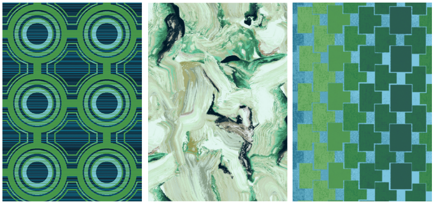
Love Emerald as much as we do?
Use Pantone 7727 C or Pratt & Lambert’s #20-14 Bed of Pine or #19-16 Frond of Green and the Stacy Garcia Commercial products below
Stacy Garcia Commercial for Brintons Camp Revamp 18/S3485SG, Stacy Garcia Commercial Textiles Meditate -Emerald 1735-20-SAN, Stacy Garcia Commercial for Brintons Camp Revamp 4/S3489SG
fran a chelico
Posted at 16:42h, 29 Octoberwhere is that light fixture from?
Stacy Garcia
Posted at 17:39h, 29 OctoberHi Fran! The designer of the space is Ashley Shaanan Interiors. Here is her website: http://ashleyshaanan.com/