
31 Dec Trend Story: Perspective
Product Shown (clockwise from top left): Stacy Garcia for Brintons – Altered Gravity, Q01/A014563SG, Stacy Garcia Commercial for Brintons – Retrospective Collection 46/LI532SG
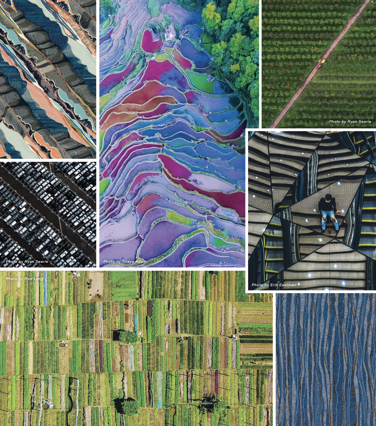
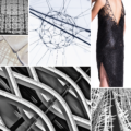
With the improvement of science and technology, we’re now able to explore worlds and views we have never been able to see before. Perspective is inspired by the views of our world shot by drones and satellites from above and the highly detailed photos taken with macro lenses and microscopes. This shift in perspective allows us to detach the image from what it is actually representing, resulting in unexpectedly abstract patterns.
Pattern:
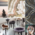
Abstract expressions, organic lines, kaleidoscope-inspired shapes, marbling & blocking.
Color:
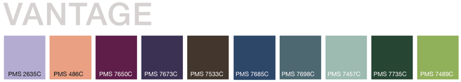
Earthy blue and green tones, nature inspired neutrals, soft pink and purple hues.
Experiment with the Color Combinations Below to Capture the Perspective Look!

A palette with varying shades of green will really capture the essence of nature, while pops of deep brown and blue keep the palette rich and grounded.

Sticking to a more subtle palette with soft, unsaturated sea blues and coral paired with a strong neutral creates a sense of sophistication.

Utilize different hues of purple accented with a bright green for a palette that has fun pops of color and personality.
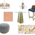
Love this palette as much as we do? The Life-Styled by Stacy Garcia team has put together a shopping guide influenced by the organic shapes and colors of Perspective:
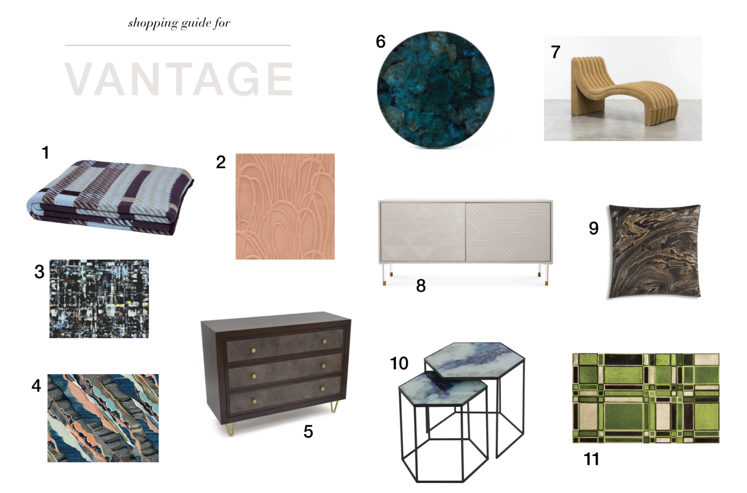
1. Stacy Garcia for In2Green – Plaid Throw, Plum/Merlot 2. Stacy Garcia New York for Townsend Leather – Candid, Rose Quartz 3. Stacy Garcia Commercial Textiles – Realm Collection, Cosmos – Azurite 1739-10-LIS 4. Stacy Garcia for Brintons – Altered Gravity, Q01/A014563SG 5. Stacy Garcia Commercial for D’Style by Kimball Hospitality – Calabasas Dresser 5111 6. 7. Shine By S.H.O – Sacha Chaise 8. modshop1 – Monaco Petite 2 Door Credenza 9. Cloud 9 Design – Ebony Throw Pillow 10. Notre Monde – Cobalt Mist Organic Hexagon Side Table Set 11.
No Comments