
28 Jun Color Crush: Crystal Water

Indulge in the pure serenity of Crystal Water as this crisp, aquatic-inspired color takes us to a tranquil, yet exhilarating place. A light, sea glass blue, this tint captures a relaxing aesthetic as we immerse ourselves in its calming, coastal vibes. Possessing a cool and cleansing appearance, Crystal Water makes us feel refreshed and energized, eliminating us from stress & discomfort. See our favorite Crystal Water palettes below.


Left: Toa Heftiba via unsplash Right: Tamara Bellis via unsplash
The Hidden Oasis Palette
Inspired by the serene setting of the Maldives, the Hidden Oasis palette is revitalizing and fresh. Pairing blue tones found in the world’s most crystal clear waters with flourishing greens and soft-sandy neutrals, it creates a crave-worthy palette perfect to use in a sun-filled living space or even when layering up for those chilly summer nights on the beach.


Left: Art Hotel Paradiso Ibiza Right: Nik Macmillan via unsplash
The South Beach Palette
Boasting an art deco aesthetic, the South Beach palette plays with dreamy pastels like sorbet pink, taffy yellow and mint blue. Featuring a throwback retro feel, the palette is modernized with an unexpected pop of matte black. Switch it up by using this color combination on hard surfaces such as geometric tiles & sleek countertops or incorporate it into your wardrobe through funky accessories that really pack a punch .
Love Crystal Water as Much as we do?
Use Pantone 12-5206 TCX or Pratt & Lambert’s 24-30 Aloe
and the Stacy Garcia Commercial products below!
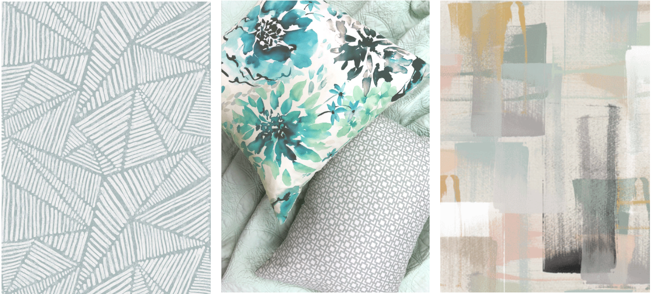
Stacy Garcia Home for Crypton Home Pattern Play Fabric Collection – Lino (Pool) Available at Calico, Stay By Stacy Garcia Set of 3 Watercolor Floral Pillows (Seaglass) & Hotel Zen Diamond Quilt Set (Blue), Stacy Garcia | New York Transitions Fabric Collection – Swipe (Pastel)


No Comments