
05 Apr Color Crush: Serene Green
Envelop yourself within the cool and calming sensation that is Serene Green. Sneaking into spring with its soft sage glow, this ethereal wash of color is the perfect match for dusty roses, terracotta, complex greys and pops of warm metallic. With strong influences derived from the Scandinavian comfort movement, Serene Green embodies the yearning to curate a lifestyle filled with happiness, health, and hygge. Gentle to the eye, yet impeccably fresh, this light-airy color expands its values from fashion to interiors, evoking an overall feeling of serenity and peace.
Want to incorporate this color into your lifestyle? See our tips below!
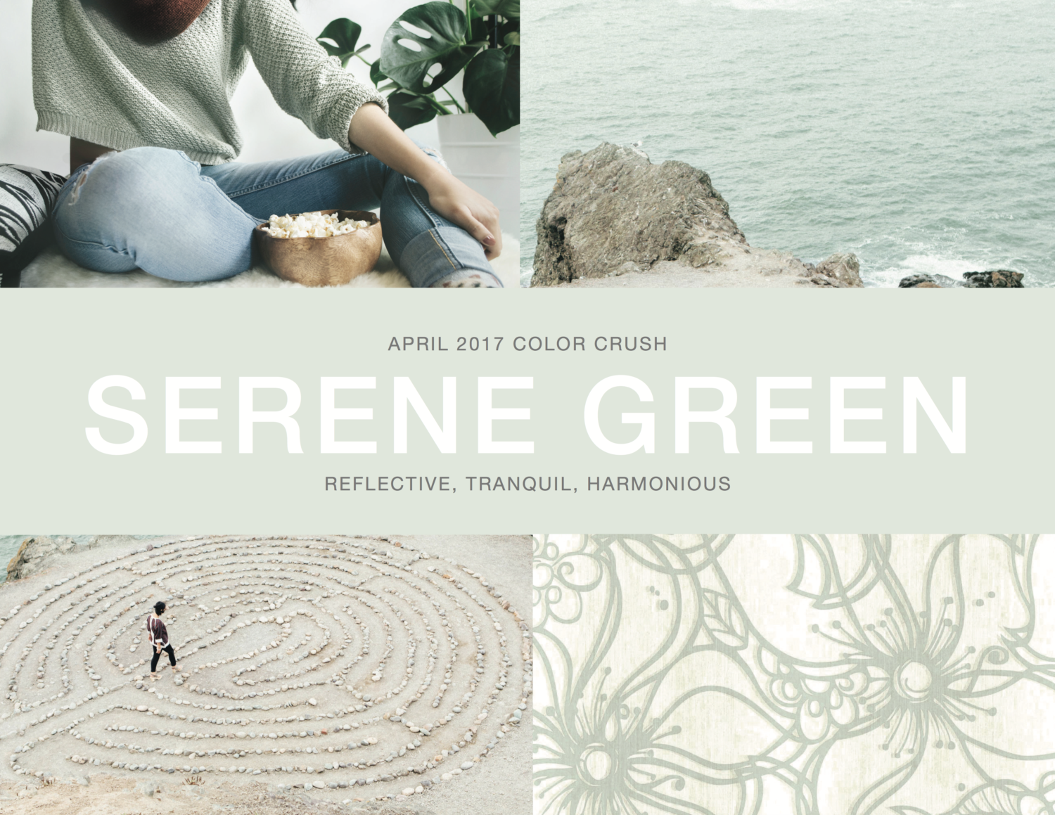
Product Shown (Lower right-hand corner): Stacy Garcia | New York for York’s Whimsical Bloom Wallpaper ST6034
Tip #1: Delicately Delectable
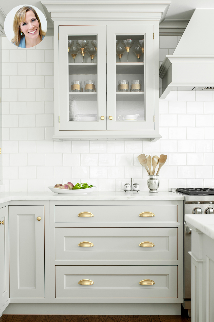
What better way to incorporate this beautiful hue into your home than in the kitchen. Once seen as merely a place for the preparation of food, the kitchen throughout the years has transformed into the ultimate gathering space for family, friends, and loved ones. Guest contributor and designer, Heidi Piron, talks about her love for Serene Green and its ability to elevate your space. “This is one of my favorite colors for kitchen cabinetry”, says Heidi. “The warm, mid-weight gray offers a fresh twist on the timeless white kitchen. Its subtle sage undertones beautifully compliment a range of white marbles, such as honed Danby, which also provides contrast to shiny white tile.” Acting as a soft gray, Heidi suggests it “is striking with brass that has a patina, and works equally well with polished nickel and/or stainless steel hardware finishes, depending on the vision of the design. Serene Green is a versatile and simply beautiful neutral.”
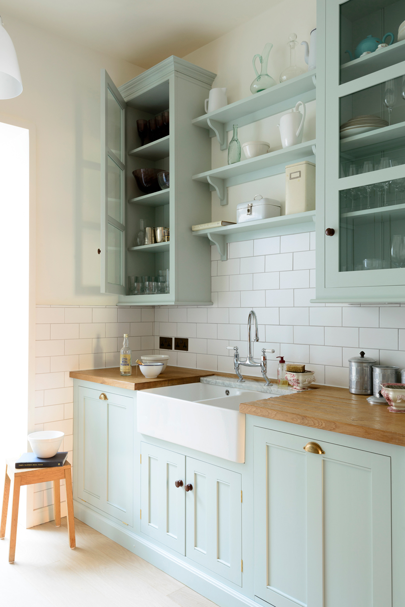
Opt for a rustic look by pairing a slightly more saturated version of Serene Green with wooden countertops, a farmhouse sink, and antique brass hardware like the kitchen seen below by deVOL.
Tip #2: Make it pop!
Why do we love Serene Green? Its chameleon like ability to change its perceived color value makes it easy to shift the ambience and overall feel to fit your fancy. Amp up the fun factor by pairing Serene Green with slightly more saturated pigments. Our favorites include pairing this soothing hue with dusty roses and citrus colors such as pear greens and lemon yellows while grounding it with a neutral taupe. Like things a little cooler? Try sticking to the same color family and accentuate with dark charcoals, jewel-toned chartreuse, and deeps greens —similar to our March Color Crush – Mystic.
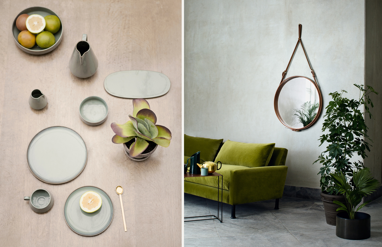
Product Shown (Left to Right): Ferm Living Tableware; Gubi Adnet Circulaire Mirror Tan from Nest.Co.Uk
Tip #3: Lighten up your Look
Make the switch in your wardrobe and swap that neutral grey or off-white for Serene Green. With its versatile appeal, this beautiful shade of green-grey is a perfect way to dress up (or dress down!) your ensemble. Consider a tailored jumpsuit paired with a few statement bracelets when the time calls for an elegant outing. Looking for a more relaxed vibe? Search for a dress in light fabrics like linen or cotton for exceptional comfort and ease.
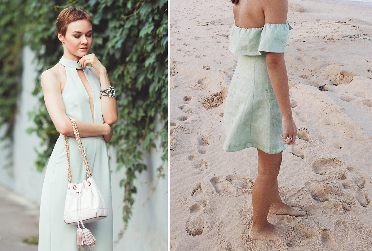
Photo Credit (Left to Right): Lidia Frolova; The Pedestrian Studio
Love this color?!? Use Pantone 9042C or Pratt and Lambert Paints – Seaspray, #20-32.
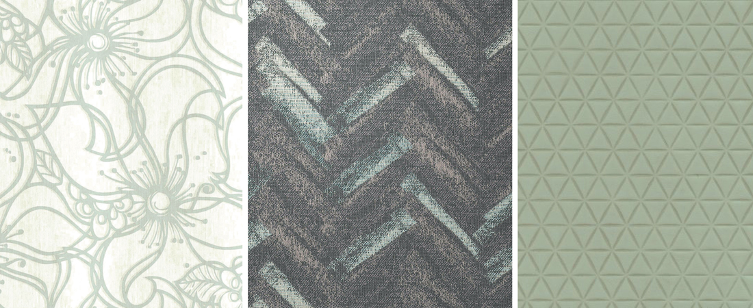
Product Shown (Left to Right): Stacy Garcia | New York for York’s Whimsical Bloom Wallpaper ST6034; Stacy Garcia Textiles Airbrush in Mineral; Stacy Garcia for Townsend’s Trifecta Leather in Mint


No Comments