
28 Oct Color Inspiration: Pass the Pastels
Every room has its own color story. As a member of Pratt & Lambert‘s Style and Design Guild, we used their paint swatches to create a color scheme based around dominant and accent colors trending in interior design. Learn how each and every color influences the ambiance of an interior space.
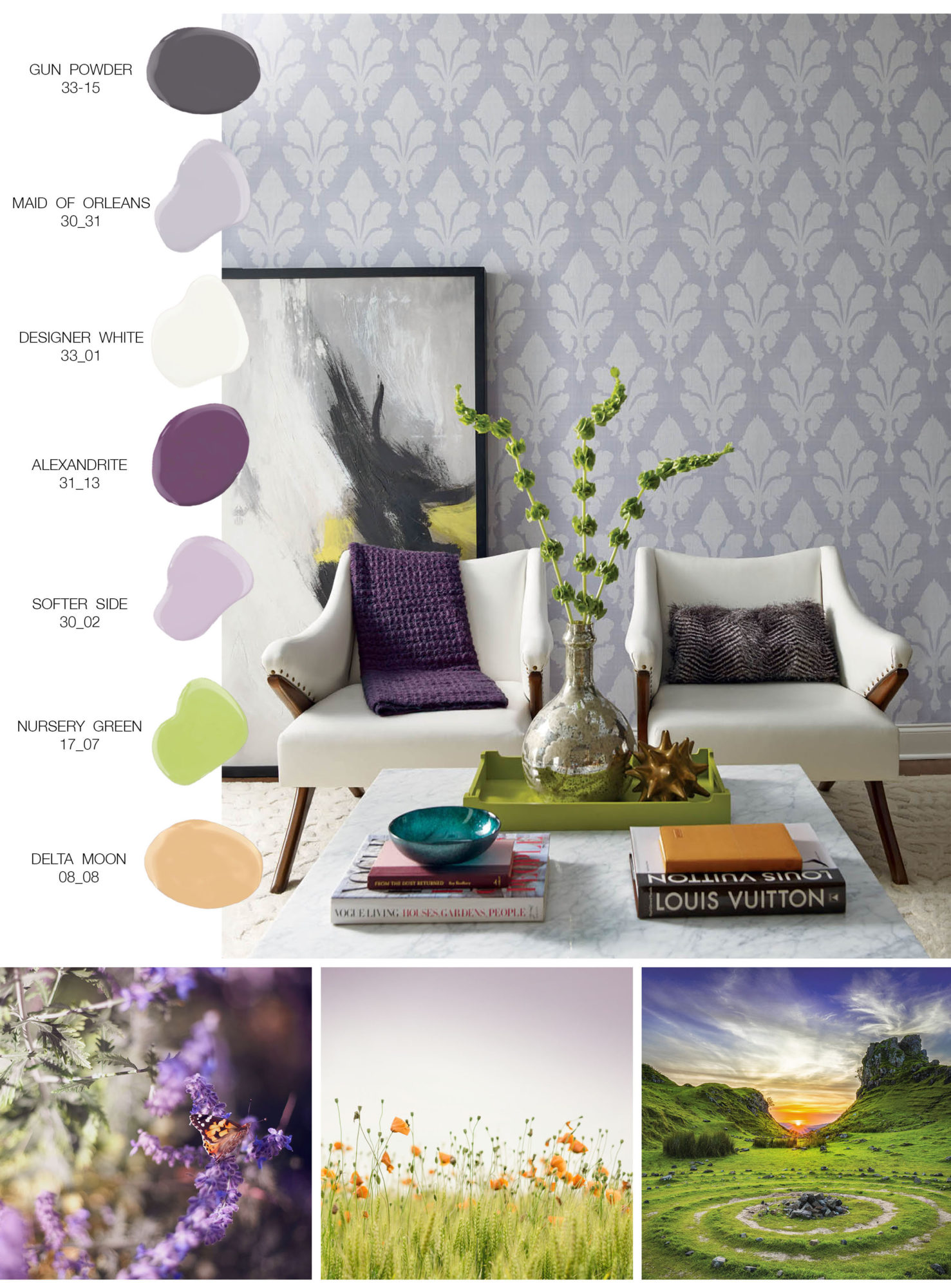
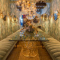
When designing a space it’s crucial to pick colors that mesh well together and create an inviting atmosphere. The room shot above featuring Stacy Garcia | New York for York Wallcovering Fleurish highlights a contemporary interpretation of a pastel palette, with bold pops of saturated color.
Clean shades of purple, a bright green hue and dark and light neutrals, create a fresh mix of color. The combination of Maid of Orleans, Nursery Green and Delta Moon is specifically reminiscent of the serenity that we feel from being outdoors and absorbing nature.
We see crossover from our Uninhibited Pastels trend which consists of flexible pastels anchored with rich eggplant, plum and dark grey. This trend, as you can see below, is a perfect way to bridge the seasons with color. The palette first appears sweet and light but takes a step further to add a level of sophistication and edge.
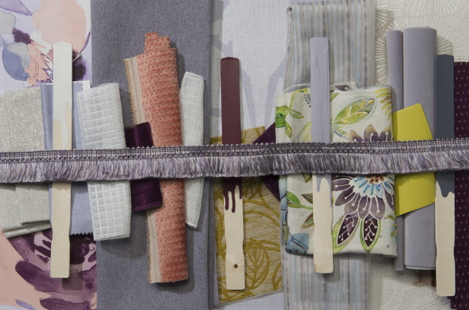
Uninhibited Pastels

No Comments