
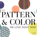
21 Oct Design Uncensored with Sue Wadden
Ready for another inspiring discussion on trend & design with Stacy’s weekly live series Design Uncensored? On this episode, Stacy hosts an intriguing conversation with the Director of Color Marketing at Sherwin-Williams, Sue Wadden! With the responsibility of developing color systems, researching color & industry trends and more, Sue tells us what colors we can expect to see through until 2022 and why.
See 3 Key Takeaways from the Conversation Below!
1. Need for Warmth
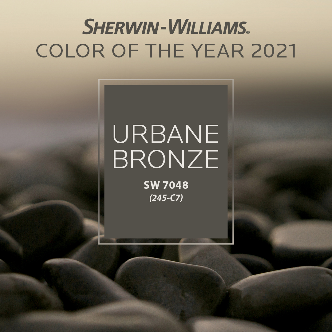
As you may know by now, nature is a key influencer of not only color, but all design elements we’ve been seeing in the past couple years or so. Although, Sue definitely believes this trend will continue, she gives some insight into how the palette is going to slightly evolve. Aside from the bone white, khaki, beige and taupe, which we are continuing to see, Sue mentions that colors are becoming much more warm to balance out these cooler tones. Sherwin-Williams’ Color of the Year, Urbane Bronze, is a color that perfectly exemplifies the true property and foggy-like depth of this metallic tone. Expect to see this color a lot next year!
For more information on the Sherwin-Williams Color of the Year, click here.
2. Drivers vs. Influencers
“Fashion is an influencer, but not a driver for me anymore. Fashion is too fast and homes are timeless,” Sue states. She explains the idea of how especially after the rough year we’ve had, consumers are looking to invest in spaces that express longevity, flexibility and security. Because many people feel heavy emotions right now, designers and people like Sue are providing their customers with everything they can to make their home feel like a safe-haven…”a place to feather your nest”.
3. A Perfect Balance
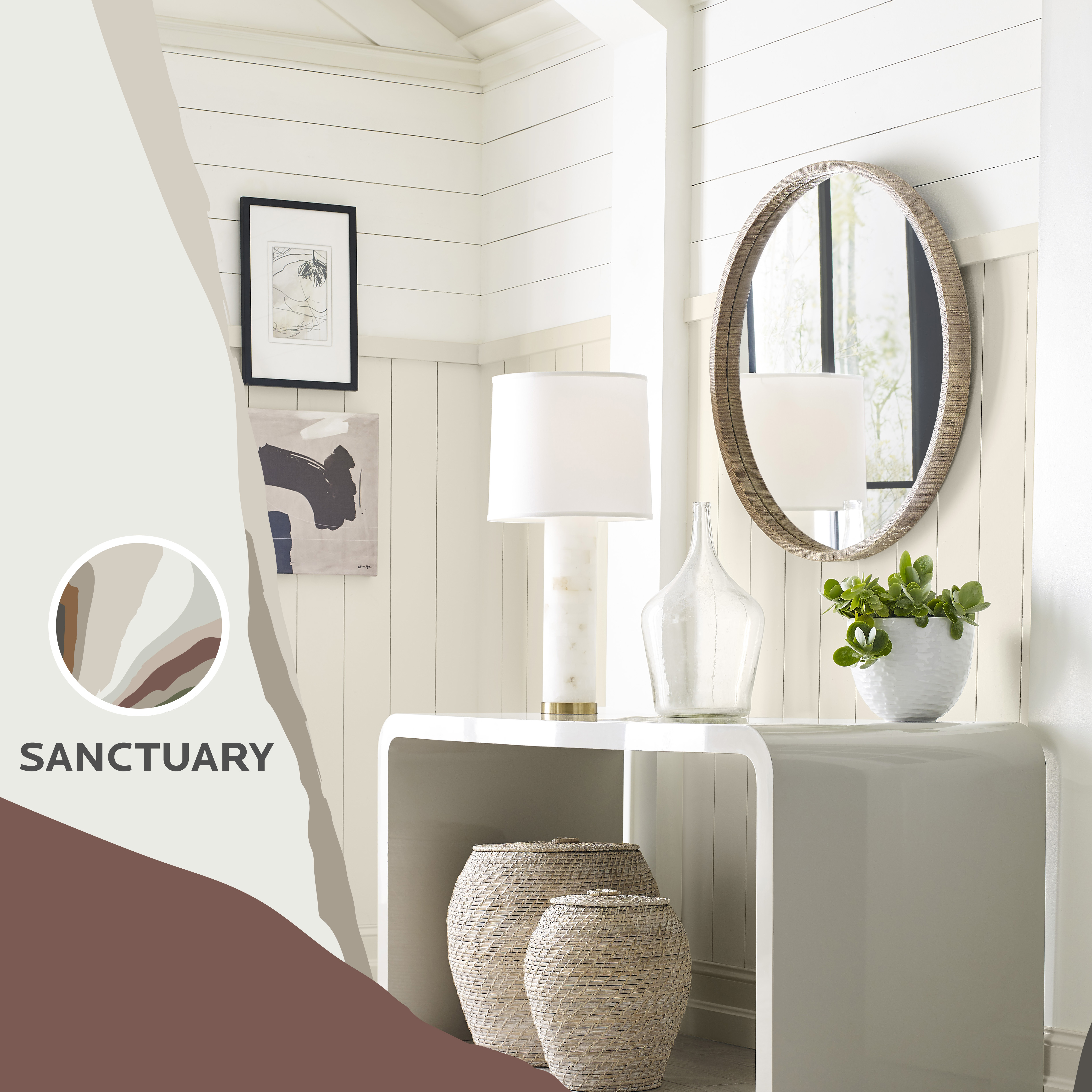
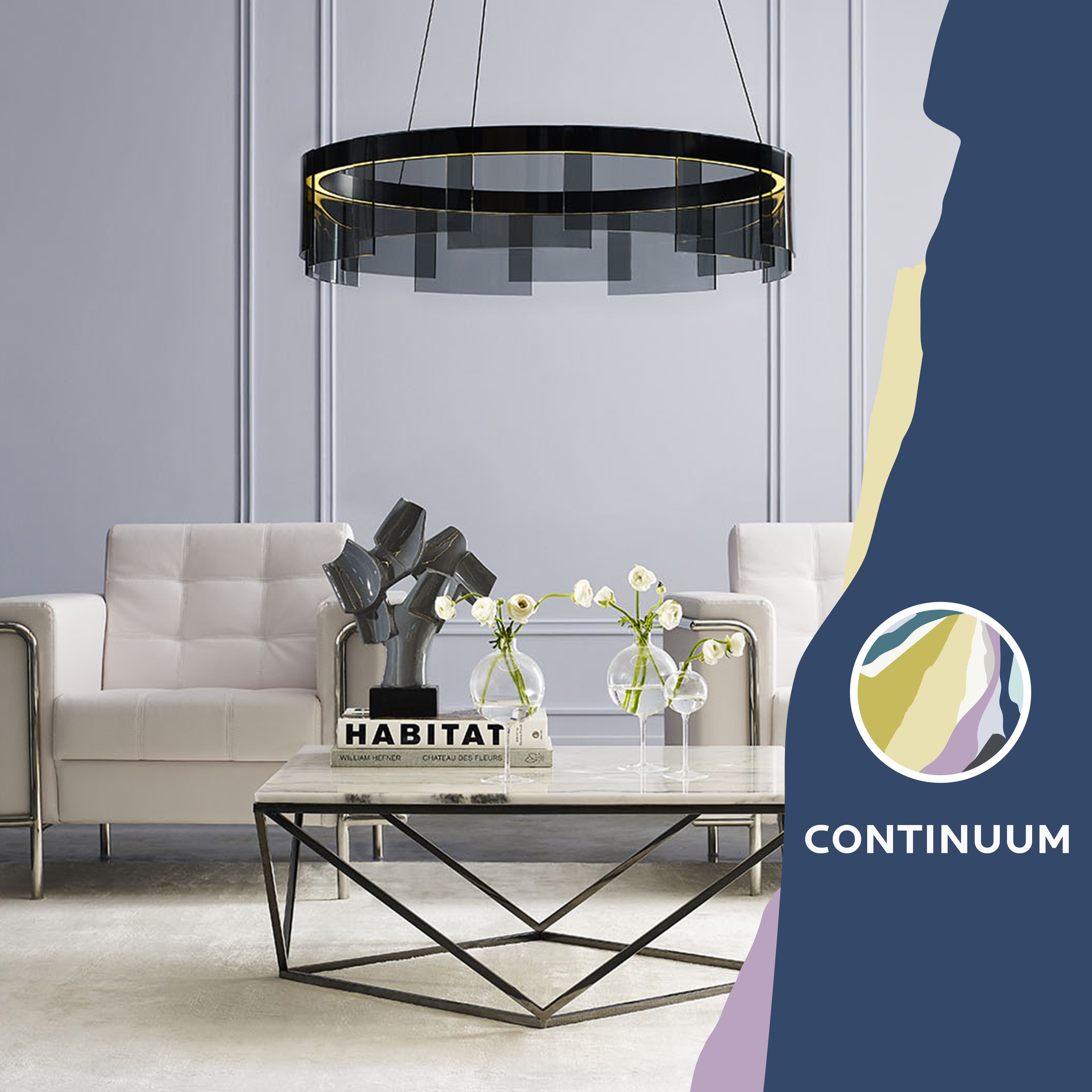
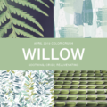
Inspired by nature, Sherwin-Williams has named their Color Mix Forecast 2021, Rhythm of Color. Featuring 40 trending colors presented in four palettes, it discovers the similarity of balance between both the natural world and how we live today. Sue mentioned there are many “tech palettes” combined with earthy, comforting tones. Although we do need tech, it can become quite exhausting and so these colors provide a sort of “digital detox” to evoke a sense of calm. Below is one of the palettes, “Continuum”, which is defined by “The optimism and imagination of mid-century modernists inspired designs that reached high into the sky and deep into the sea. This palette of white, charcoal and pops of color celebrates that spirit as it bounds fearlessly into the future.”
For more information on the Sherwin-Williams Color Mix Forecast 2021, click here.
More About Sue Wadden
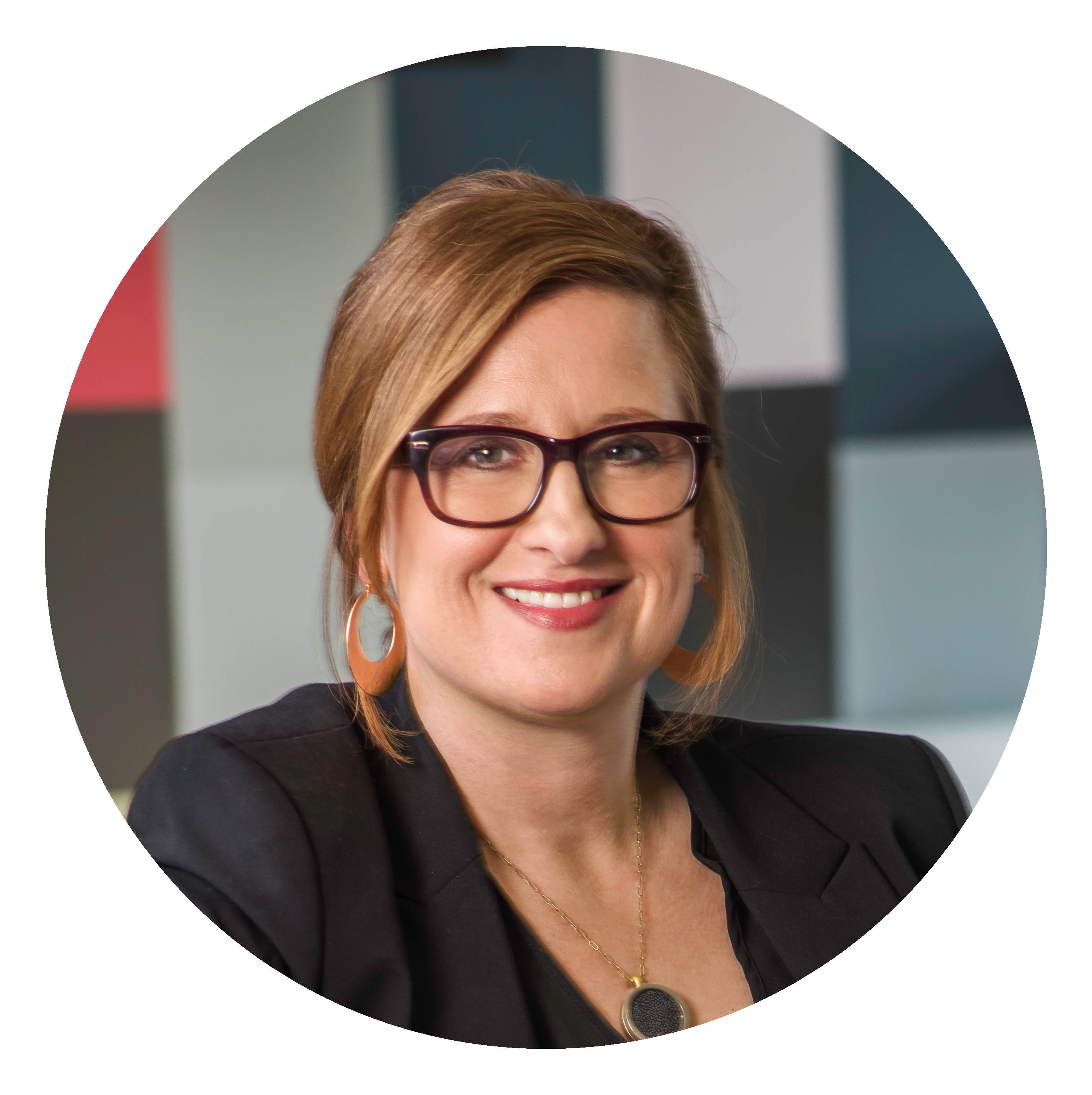
Sue Wadden began her career as a color expert at Sherwin Williams in 1998, as an interior designer and color marketing specialist. She then became a senior color marketing designer for the company. In 2013, she became the color marketing and design manager for Sherwin-Williams Diversified Brands Group. In January 2016, Wadden was named Sherwin-Williams director of color marketing for The Paint Stores Group. As director of color marketing, Wadden is the resident expert on color for Sherwin-Williams, responsible for the company’s overall viewpoint of color leadership.

No Comments