
19 Apr Color Crush: Back to the Fuchsia
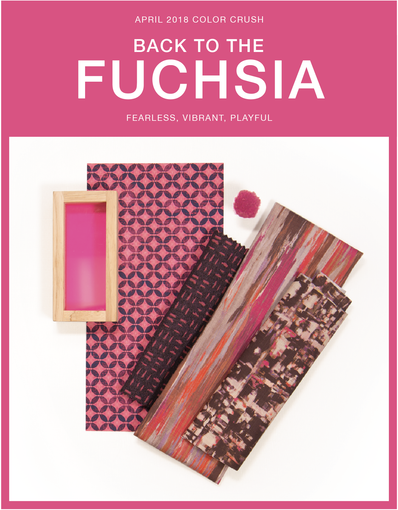
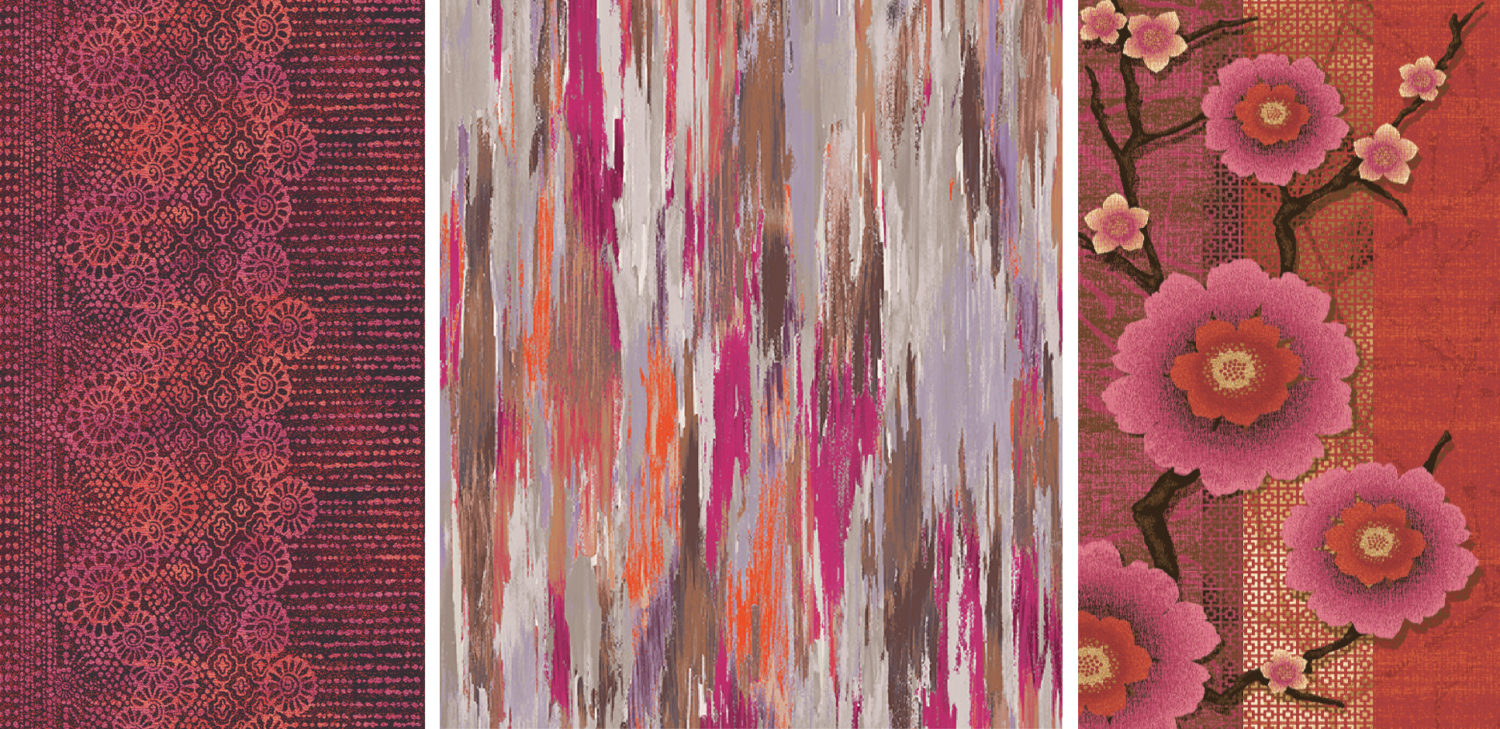
Product Shown: Stacy Garcia Composition Textile Collection Woodcut-Wild Berry, Stacy Garcia | New York Art Universe Textile Collection Invigorate-Magenta, Stacy Garcia | New York Art Universe Textile Collection Nebula-Jupiter
Bright and fearless Back to the Fuchsia is bringing bold energy! The allure of this attention-seeking hue stems from the demand of brilliant colors in interiors to balance the popularity of neutrals and pastels. We see Back the the Fuchsia as the bold relative to Millennial Pink, a hue that ruled fashion and home decor in 2017. Contemporary and vibrant, Back to the Fuchsia creates a playful atmosphere, adding a much needed component of true color.
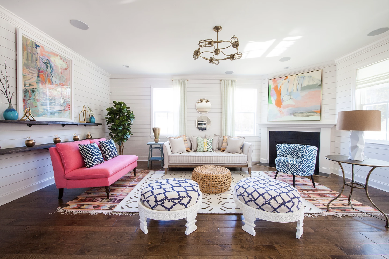
Stay Bold
This color is for the daring! Use Back to the Fuchsia for a fun accent piece in your furniture. Pair this tone with bright whites and pastels for a light and airy feel. Bold hues and patterns like this work well together as a way to breathe life into a space.
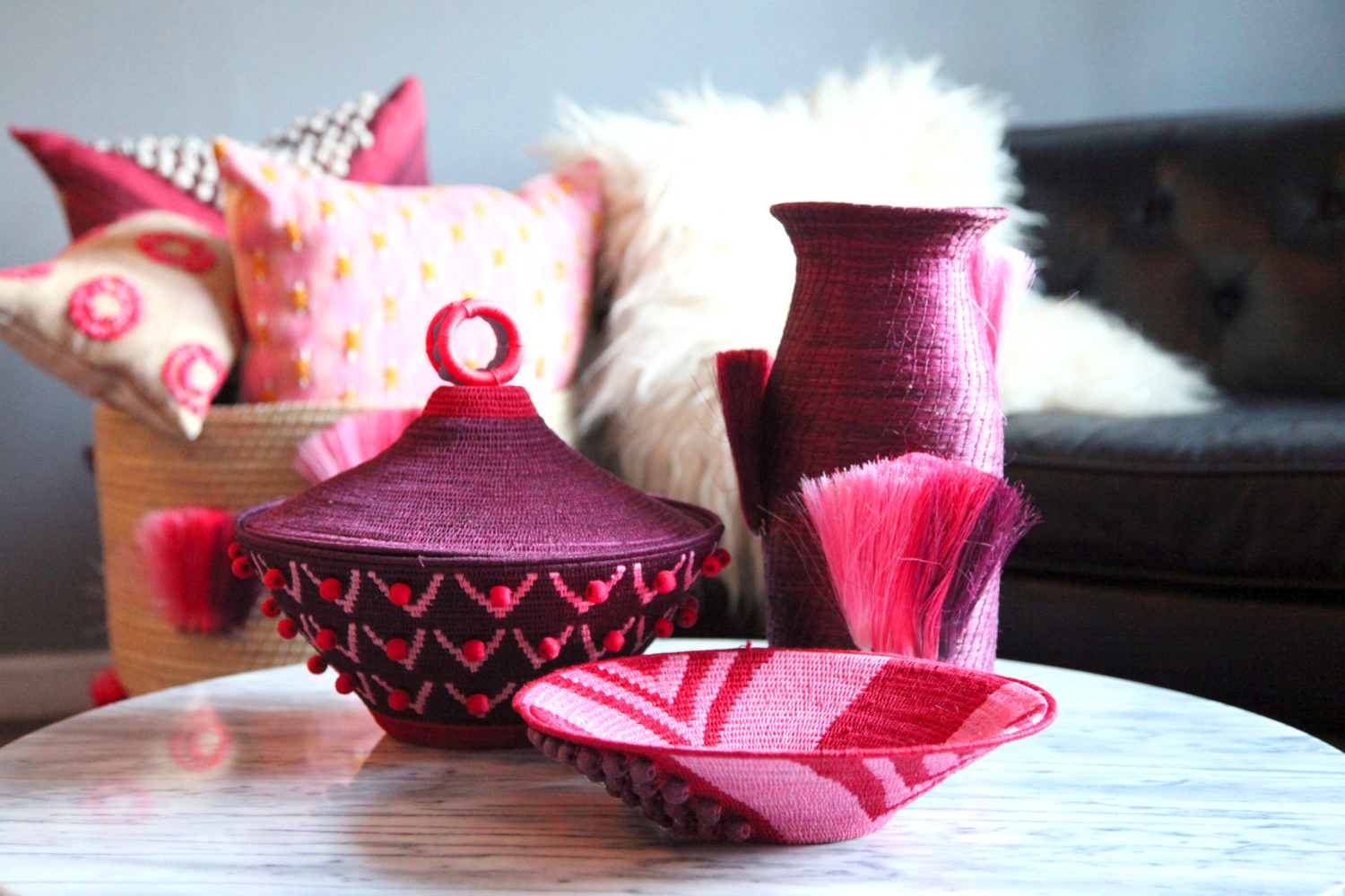
Eclectic Accents
Back to the Fuchsia works great in your decor for those who are weary to commit to color. Accessorize your home with decor in bright pink for an energetic feel, or darken the hue for a moody ambiance. Keep your space fresh and eclectic with woven pieces and embellished textiles. These types of globally-inspired elements add a touch of personality.
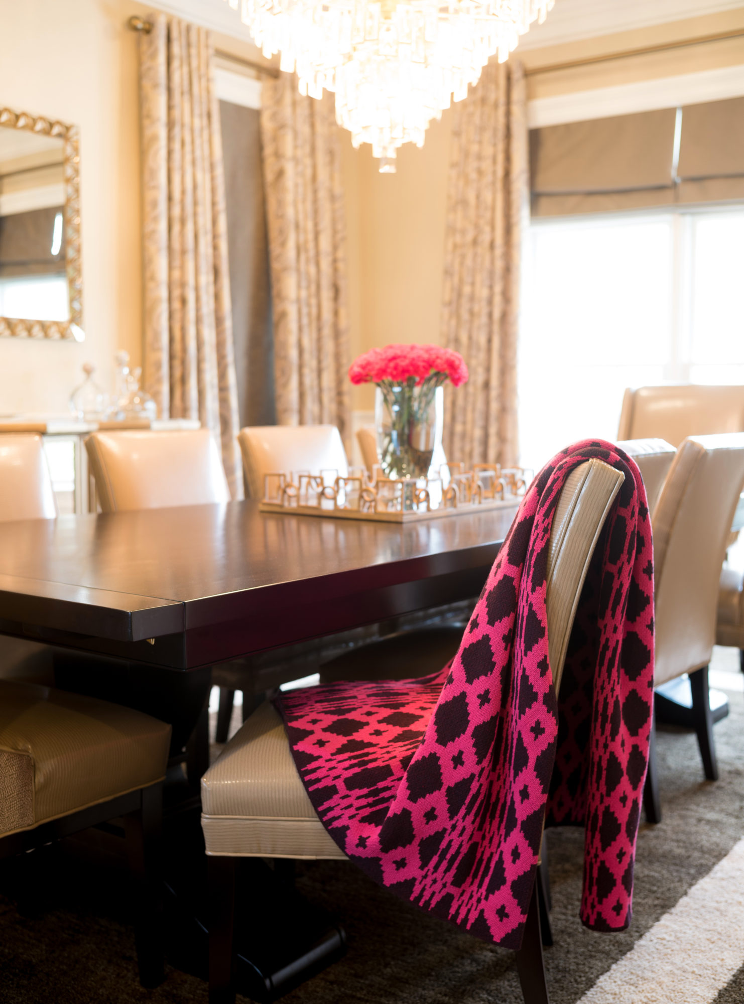
Luxe Layering
Who says a traditional design scheme has to be boring? Spice up your space with a pop of Back to the Fuchsia! A small amount of this color goes a long way to increase the richness, depth and interest within an interior. Layered with other textures, Back to the Fuchsia will leave a high-end impression.
Love Back to the Fuchsia as much as we do?
Use PMS 7424 C or Pratt & Lambert’s #2-14 Cerise Delight
Product Shown Left to Right: Stacy Garcia for Brintons, The Urban Nomad Collection, 4/QV25vSG, Stacy Garcia | New York – The Art Universe Textile Collection-Invigorate-Magenta, Stacy Garcia for Brintons Carpets-3/X0375SG-The Curator Collection

No Comments