
20 Nov Color Crush: Porcini
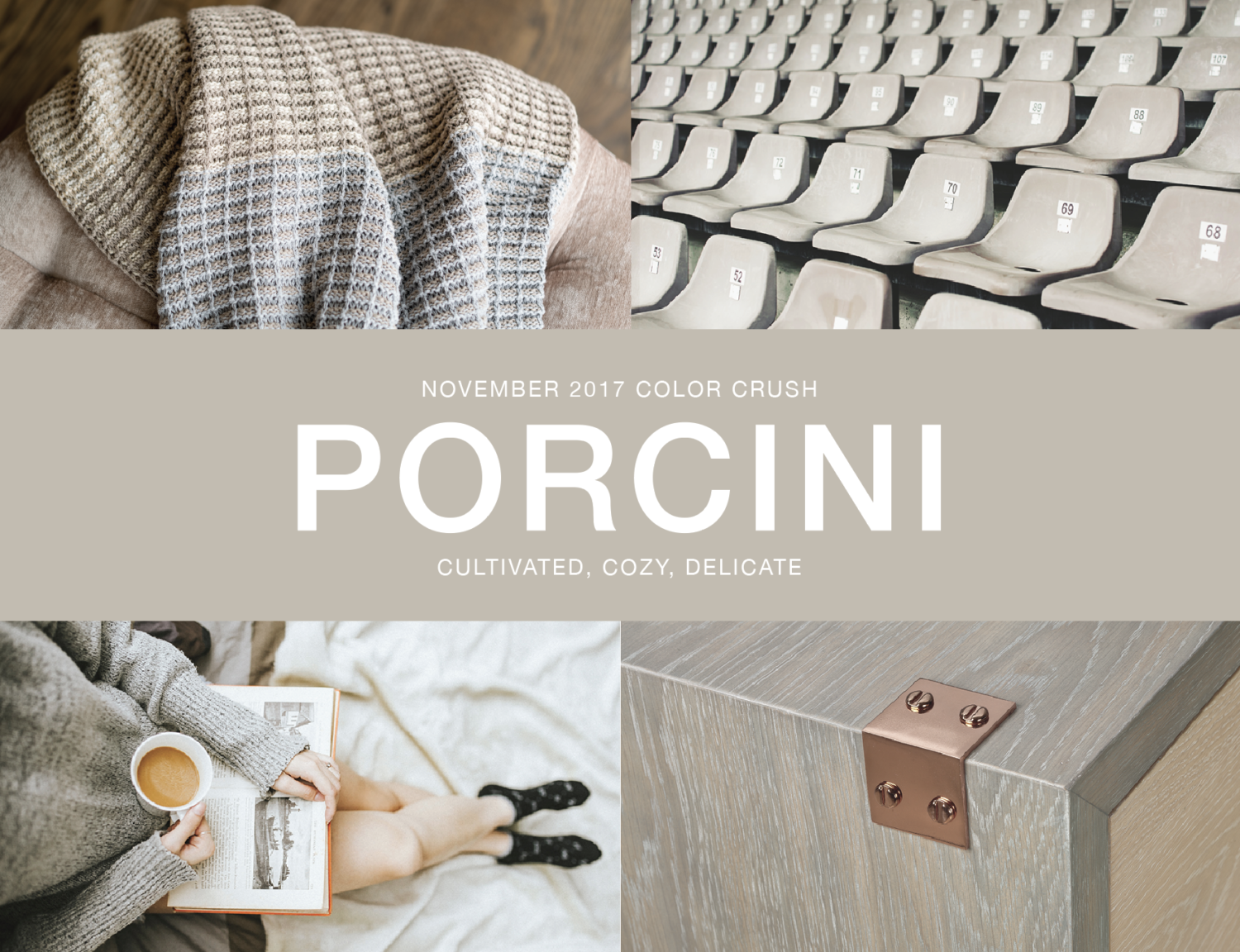
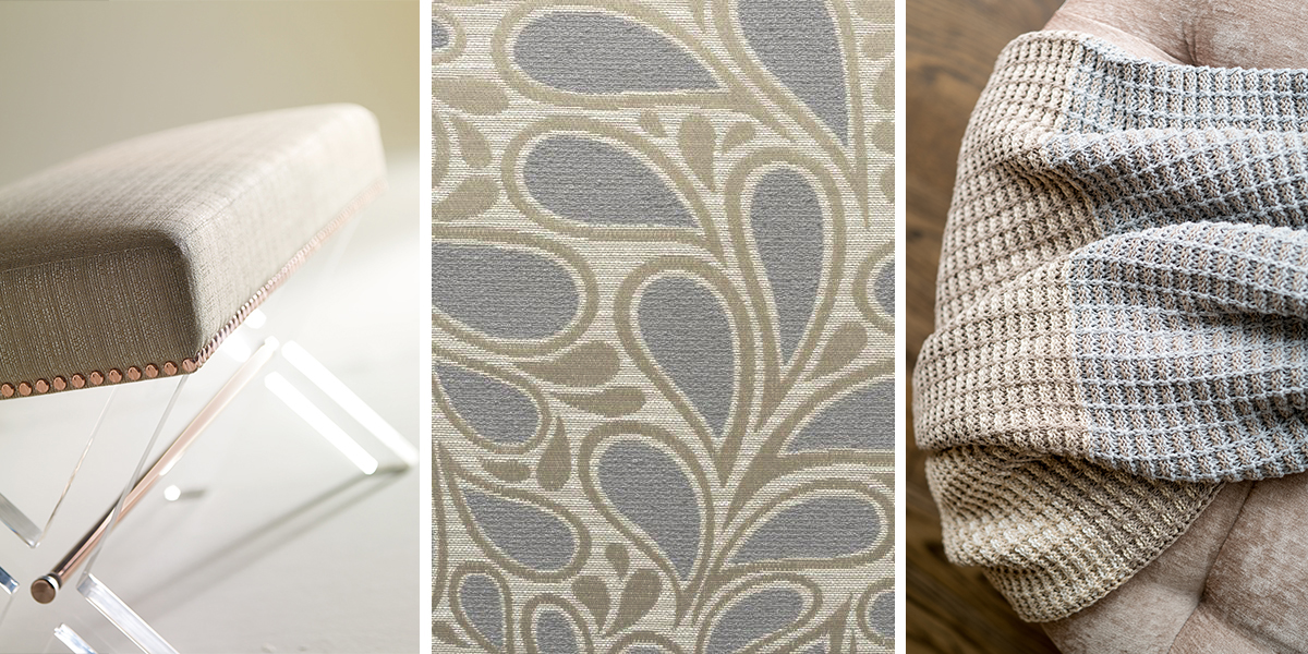
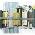
Products Shown – Top Left: Neutral Stitch Stripe throw by Stacy Garcia│New York for In2Green Bottom Right: The Foundry Collection by Stacy Garcia for Bernhardt Hospitality
Cultivated and cozy, Porcini is a versatile tone that makes any space feel like home. Creating a calming and approachable feel, this delicate neutral adds subtle depth to your interiors. We see the emergence of Porcini as color transitions away from cool grays and moves into warmer neutrals.
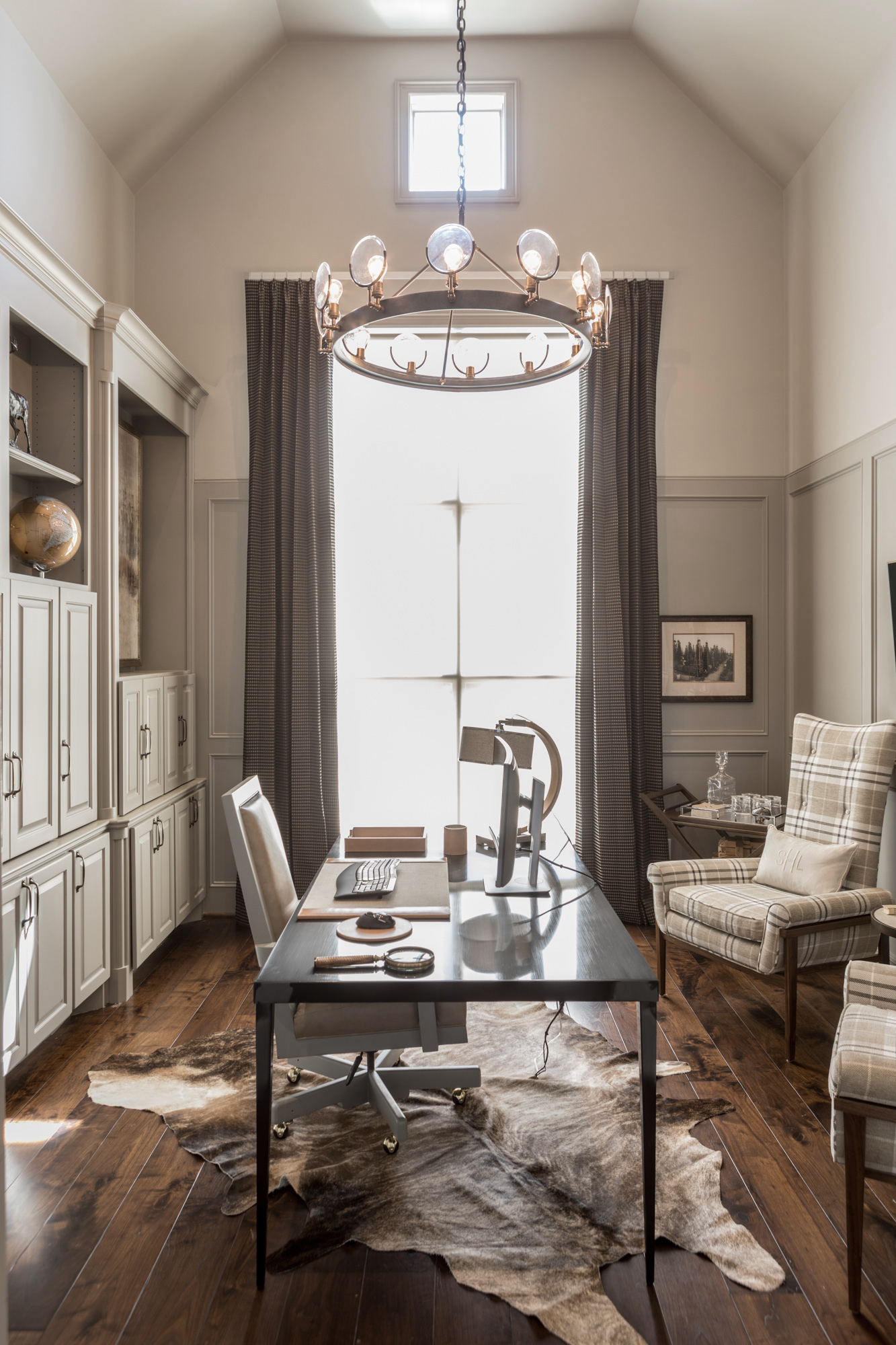
CREATE BALANCE
A timeless and practical color, Porcini pairs well with other neutral design elements,
balancing your space. Use Porcini to add a soft touch in a mix of masculine components like wood, furs, and metals. This blend of color and material is great way create a warm environment for the cold winter months.
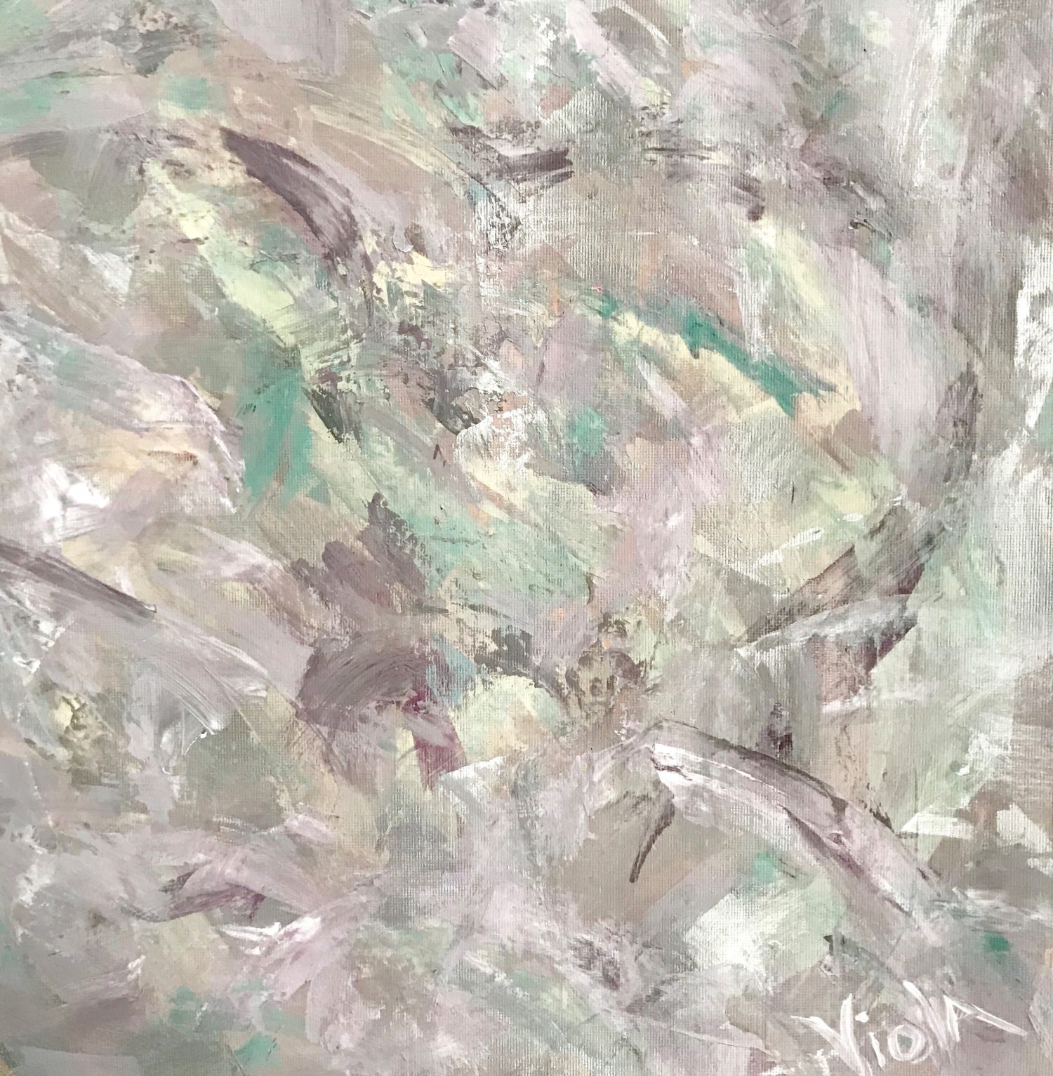
COLOR MIXING WITH PORCINI
We spoke with artist, Debbie Viola on how to pair Porcini with other hues. “I love using this color mixed in with other neutrals such as white and cooler shades of gray. It’s subtle enough to create a beautiful, soft spot in a painting where you can rest your eyes. It also works well with shades of blue, with some silver. I tend to sprinkle in some metallics with my art, whether it’s a landscape or an abstract piece. The silver is a nice contrast against the soft pinkish neutral of the Porcini.”
Love Porcini as much as we do?! Use Pantone 406C or
Pratt and Lambert Paint 32-27, Feather Gray.


No Comments