
14 May Spotted: Rutherford at Charlotte’s Speakeasy
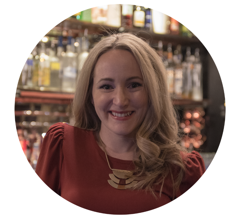
Leah Prevlites. founder of studioBIG
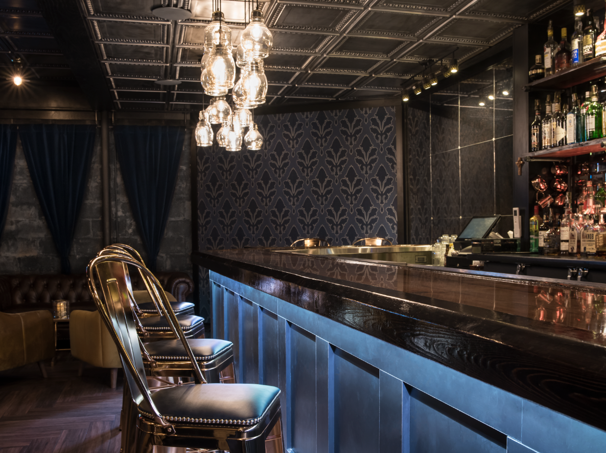
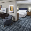
We spoke with Leah Plevrites, founder of studioBIG about her interior design process. Recently, she used Rutherford by Stacy Garcia for York Wallcoverings in Charlotte’s Speakeasy in Farmingdale, New York. The wallcovering was used to create a glamorous feel to speak to the bar’s branding and overall aesthetic.
Tell us a little more about your background as an interior designer!
“I graduated with a B.Arch in 2007, however was always interested in Interior and Graphic Design, and how both truly could bring the many facets of Architecture to life. I think the careful blending of these 3 genres yields impressive & successful results.”
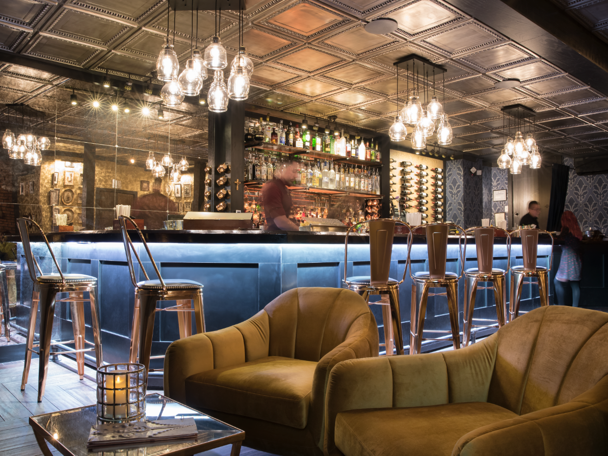
Charlotte’s Speakeasy photo by Harriet Andronikides
As an authentic restored speakeasy, what was your goal for this project’s interior?
“My goal was to properly balance glam & grunge; I wanted the lounge atmosphere to appeal to today’s bar guests’ standards, while not stretching too far away from the original speakeasy’s roots.”
Where did you look for inspiration when it comes to this project?
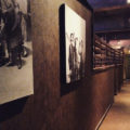
“Every corner! But the truest inspiration came from the original decorative wall tin the owners found in the basement when they first moved in, which featured a beautiful fleur-de-lis pattern embossed on the old metal. This small element was the catalyst for all the branding direction and steered my selection for many finishes. We reclaimed every piece of the metal, used it at the new entrance lining the staircase walls, and even used the left over ‘scraps’ as 3-dimensional menu covers; this simple symbol birthed many of the bar’s interior and branding concepts.”
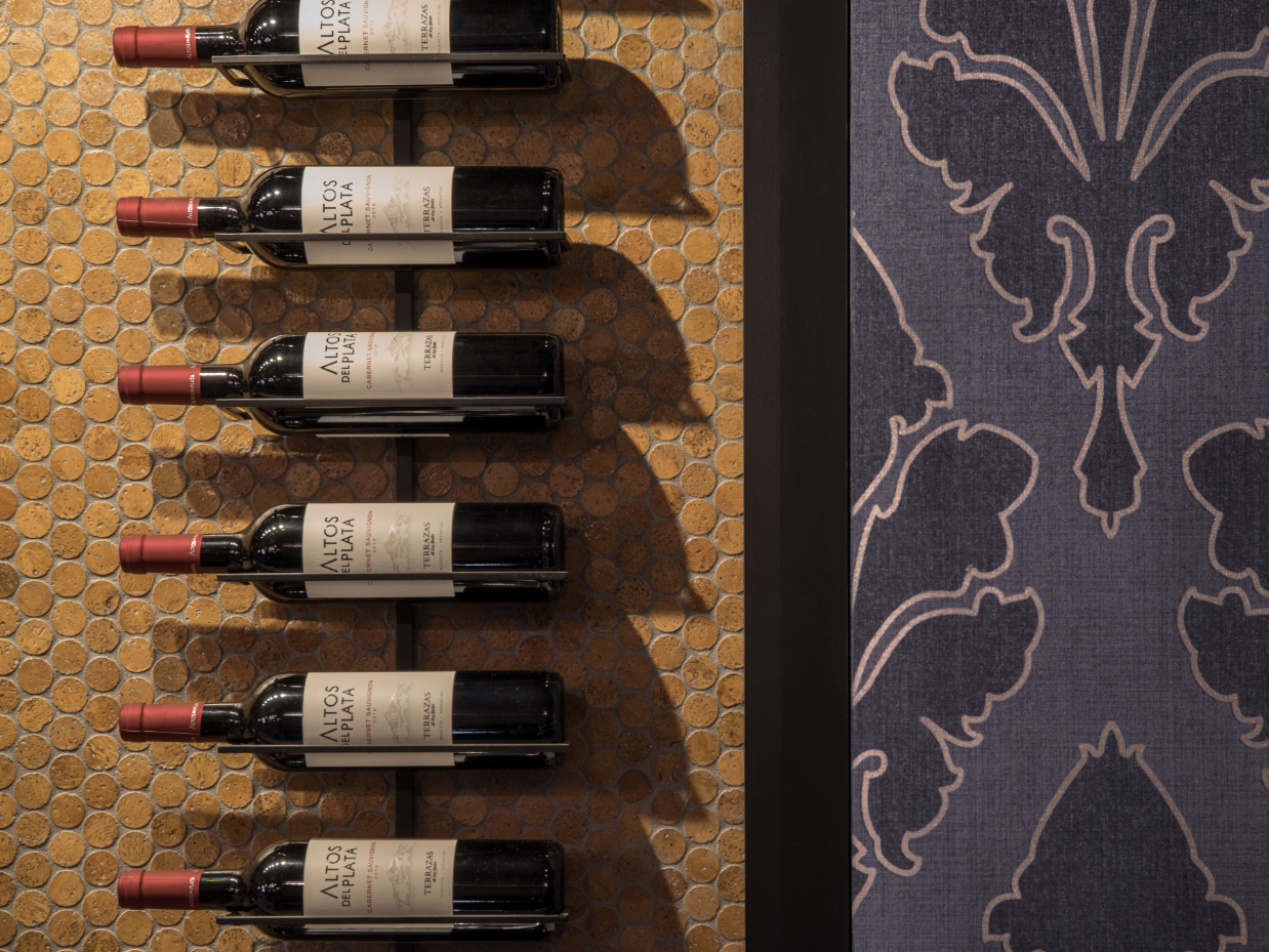
Charlotte’s Speakeasy photo by Harriet Andronikides
What drew you to the Rutherford pattern by Stacy Garcia for York Wallcoverings? How did it fit with your vision for the design of this property?
“The Rutherford pattern was a must; it had the right hues of blues and metallic accents, it was bold, demanding attention, and the fleur-de-lis pattern created visual ties to the bar’s branding and new logo we created.”
What trends are you seeing in hospitality design?
“‘Eclectic’ design and bold branding statements. I think people like a space when there are many interesting intertwined elements to pay attention to and feel throughout all their senses. A combination of different textures to feel, the sheens of materials and bold patterns to see, proper lighting to create the right ambiance, different levels of seating and diverse furniture; all selections meticulously selected and then tied together to one solid brand.”
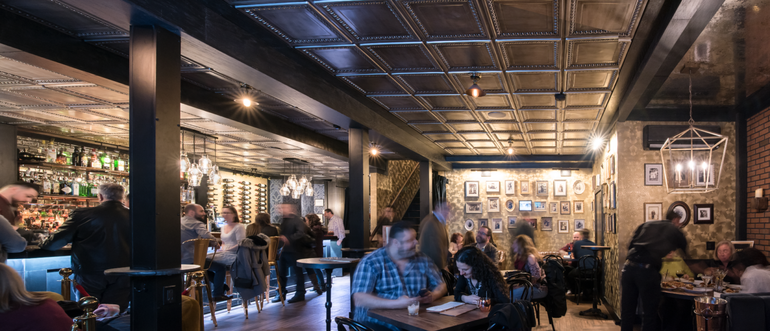
Charlotte’s Speakeasy photo by Harriet Andronikides
What’s next?
“Restaurant design is our niche and a true passion; each place has its own brand style different from the next, that’s what makes it so much fun to design. However, our next goal is to sign a hotel (quite possibly with a restaurant and bar inside!) where we would be in charge of all aspects of project branding and interiors. The many guest rooms, lobby and shared public spaces inspire endless creativity to please all senses and implement strong branding elements that create cohesive spaces and feelings for hotel guests. We thrive through challenge and it would be thrilling to implement our talents and innovative thinking in such a project!”
Charlotte’s Speakeasy photo by Harriet Andronikides
No Comments