
22 Dec Color Crush: Greenery
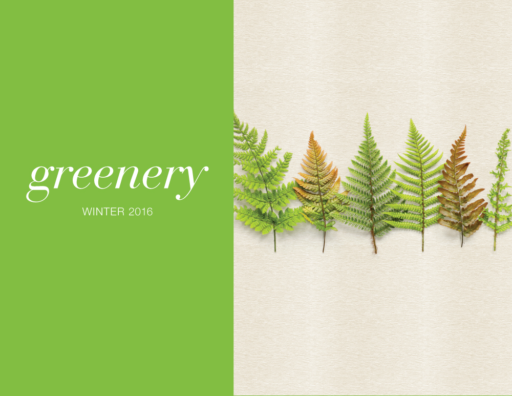
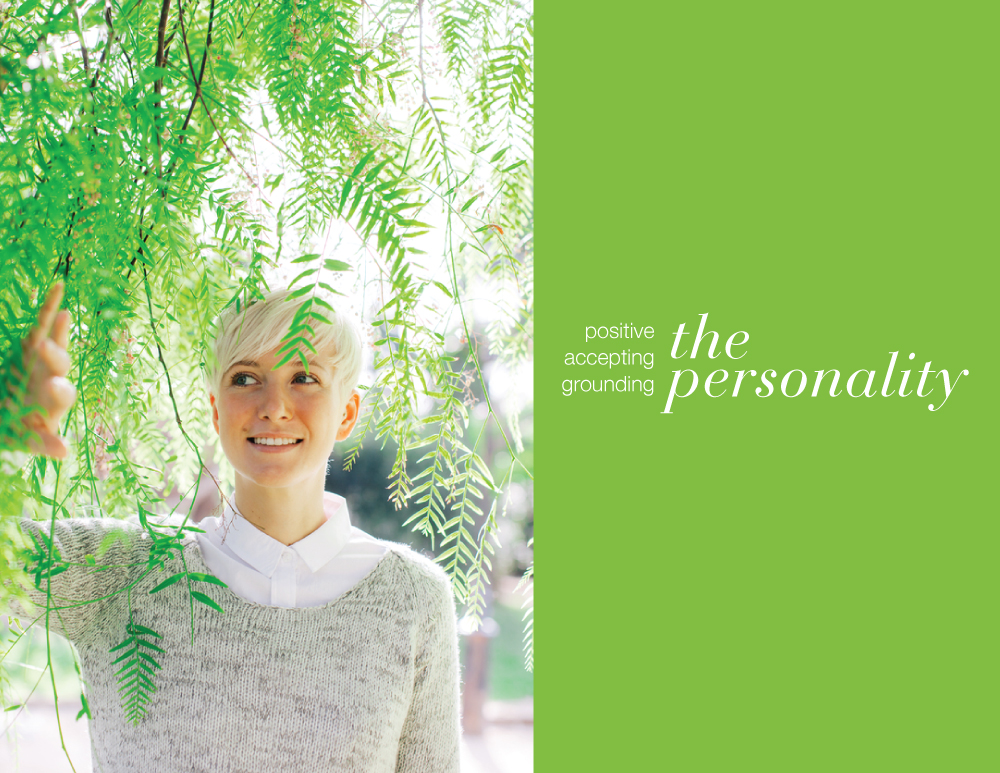
This month we are featuring Pantone’s Color of the Year, Greenery! Greenery is an all-encompassing color representing positivity, reconnection, and social acceptance. In the tumultuous world of current day, this down to earth hue keeps us grounded, reminding people to take time out of their day to rejuvenate. With a yearning for the great outdoors, Greenery, connects us back to nature and our primitive roots. It’s vibrancy and confidence demands attention and can be mixed and matched with a variety of other colors, shades, and tones.
Bring the outdoors in! Use Greenery to liven up an interior space such as a dining room, like in this space from DIFFA’s Dining by Design.
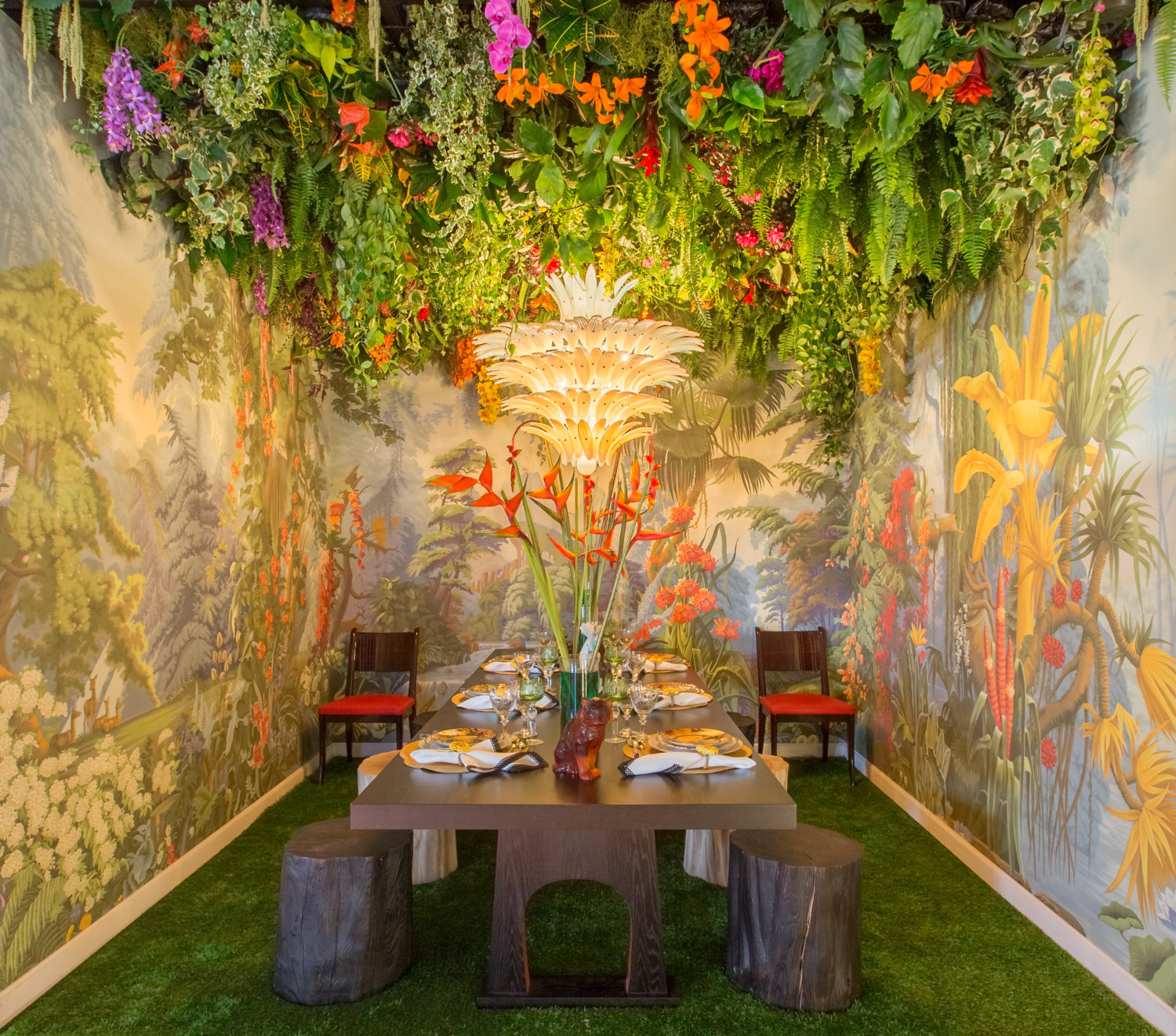
Dining by Design 2016: Luxe Interiors
Use Greenery as a fun, unexpected pop of color. Greenery’s vivid hue is packed with energy to brighten up a dark room.
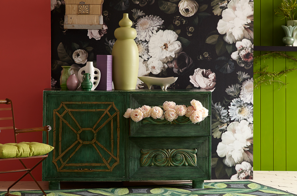
Sherwin Williams – Buoyant Color Story
Like this Color? Use Pantone 376C or Pratt and Lambert’s Envy’s Eyes, 17-14!

No Comments